Creating Data Visualizations
First things first.
Before starting this section you should:
- Learn about NodeBox concepts.
- Learn about random: to learn how randomness works in NodeBox.
- Learn about subnetworks.
Random numbers.
Nodebox can be used to create data visuals. We will go over a few principles but let's first visualize a set of random numbers.
- Create a random numbers node. Set Amount to 15 and End to 200.0.
- Create a rect node. Set Height to 20 and connect random numbers1 to Width.
- Create a count node and connect random numbers1 to it. We will use this to create a set of random colors and as an amount of points on a line node.
- Create a line node. Set Point2 to 0.0 and 300.0, returning a line going straight down.
- Create a resample node to make a list of points from it. Set Method to amount. Connect count1 to Points and connect line1 to Shape.
- Create a translate node and connect rect1 to Shape* and resample1 to Points. Double click it to see the result.
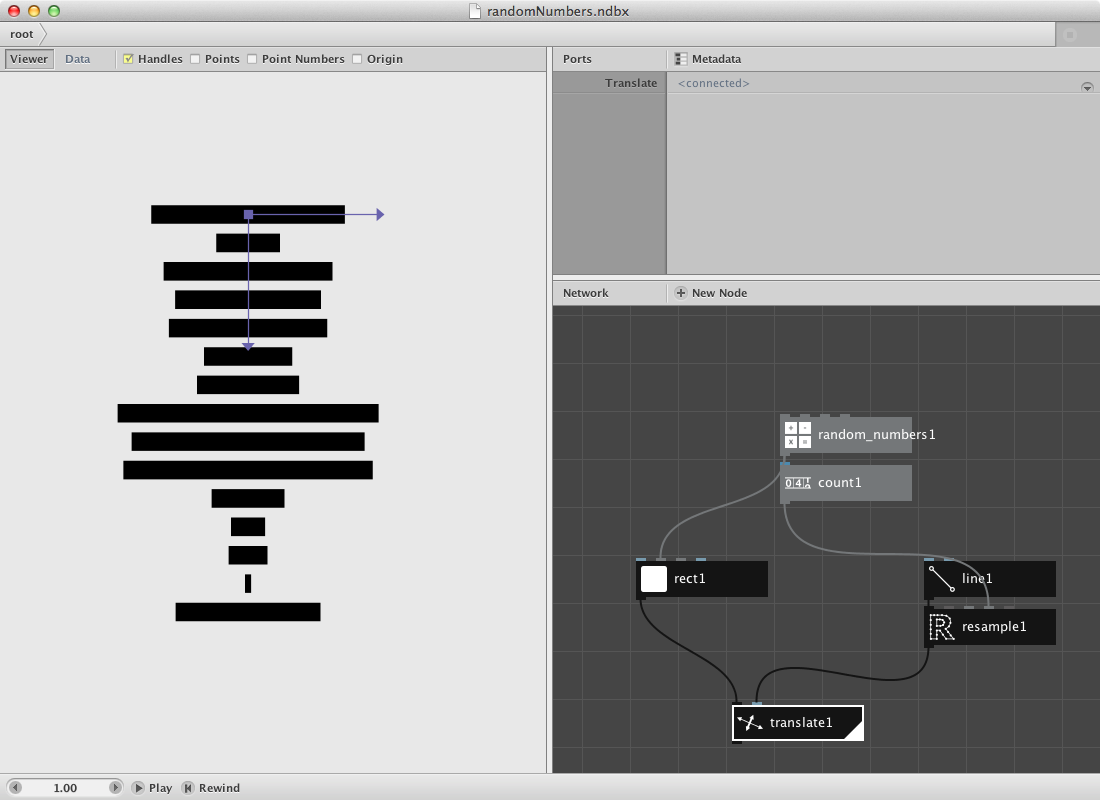
Let's clean this up a bit with some extra nodes.
- Create a colorize node and put connect rect1 to it. We will give it a colour based on the weight of the random number as a color value.
- Create an align node. Set Halign to Left and Valign to Middle. Connect colorize1 to it and connect it to Shape of translate1.
- Create a hsb colour node. Set Hue to 150.0 and Saturation to 173.0. Connect randomnumbers1 to Brightness.
- Connect hsb coulour1 to Fill of colorize1.
- Render translate1.
- Change Seed of random numbers1 to change the set of random numbers and thus the visualization.
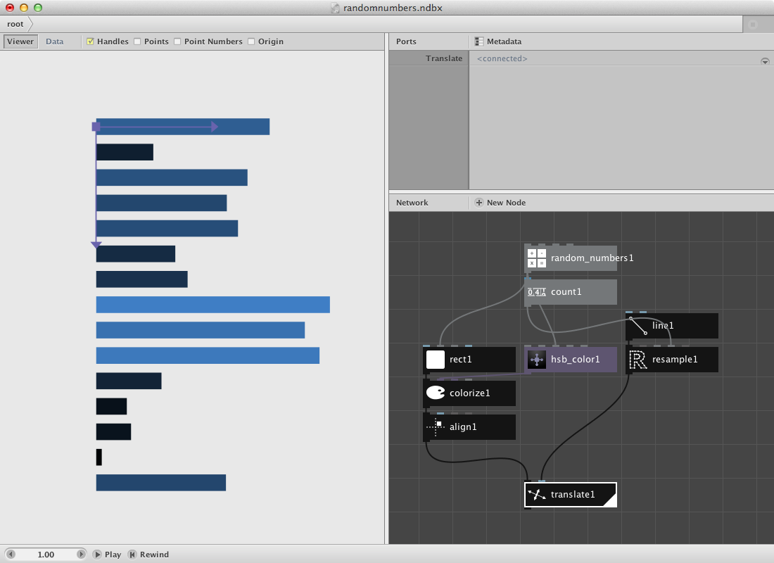
The cost.
Following data was found online and stores a few macro economic figures and their explanation. We will do a similar example as above. You can have a look at the data or download a clean version of it here.
- Create an import csv node. Point to Debtris.csv in File. This reads in the complete csv file. Nodebox shows the file in the network pane.
- Create two lookup nodes. Set Key of lookup1 to description and of lookup2 to pound. These values refer to the index value of each column of the csv file. Connect import csv1 to both of them.
- Create a textpath node and connect lookup1 to it. Set Align to Right. Select a font and type.
- Create a rect node and connect lookup2 to Width. Set Height to 20.0. The values of lookup2 are rather big so you might also want to add a divide node in between lookup2 and rect1.
- Create an align node and connect rect1 to it. Set position to 10.0 and 6.0. This create a small shift upwards and to the right. Set Halign to Left and Valign to Middle.
- Create a combine node. Connect textpath1 to List1 and align1 to List2
So far for the data itself. Now let's create a similar shape as before to map the data on.
- Create a count node and connect import_csv1 to it.
- Create a line node. Set Point2 to 0.0 and 600.0.
- Create a resample node to make a list of points from it. Set Method to amount. Connect count1 to Points and connect line1 to Shape.
- Create a translate node and connect combine1 to Shape* and resample1 to Points. Double click it to see the result.
Try implementing color to the network.
Earthquakes.
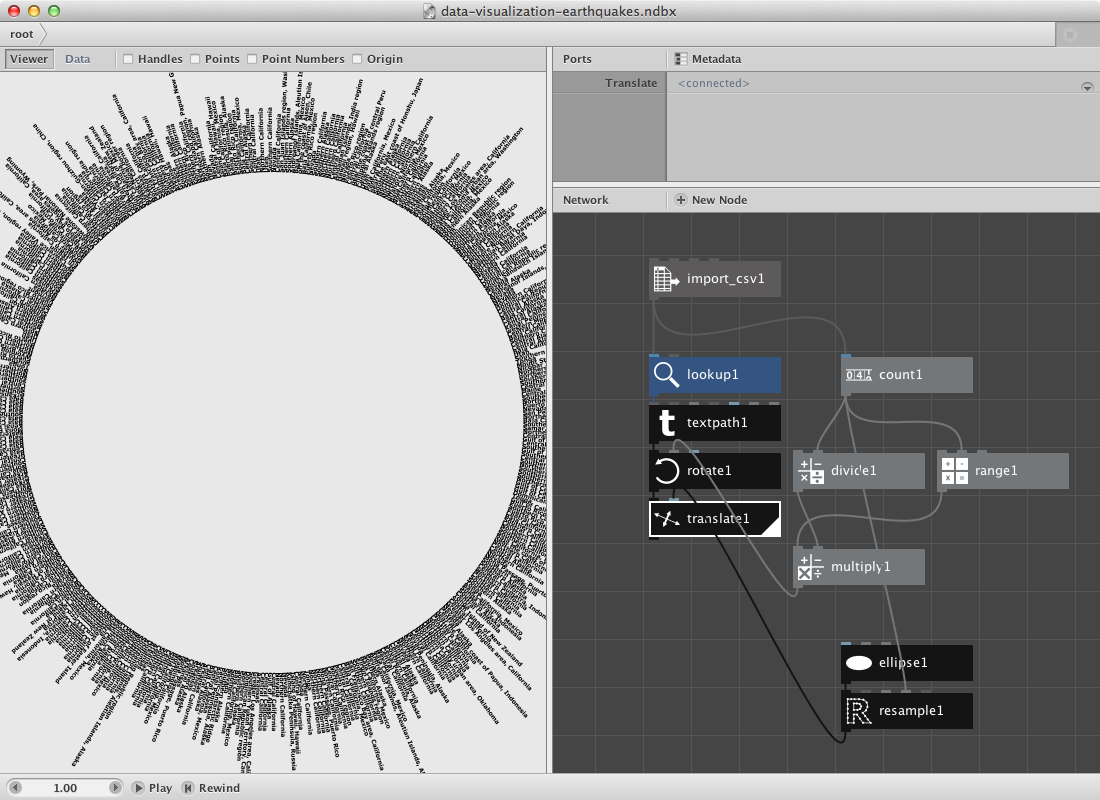
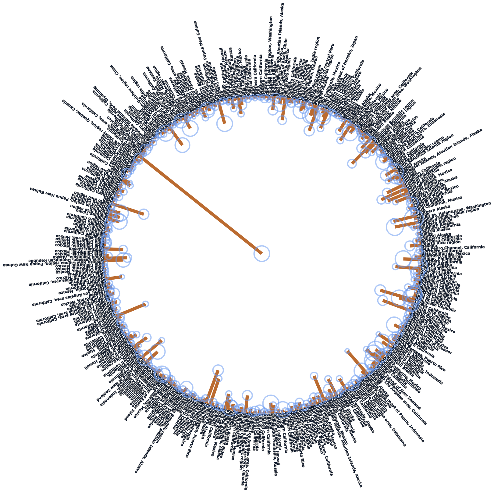
They way data is represented can differ. In stead of using a line we will go over a procedure for an ellipse. Download this earthquakes data file.
- Create an import csv node and point to the csv file.
- Create a lookup node and set Key to Region. Connect import_csv1 to it.
- Create a textpath node. Set Align to Left. Connect lookup1 to Text.
The result so far is all information as text on top of each other. Next procedure will build the template to be used as points to translate all these different textpaths on.
- Create an ellipse node. Set Width and Height to 500.0.
- Create a resample node. Set Method to Amount. Connect ellipse1 to Shape.
- Create a count node and connect import_csv1 to it. We will use this number to figure out what degree each segment needs and to create a range to multiply it to this segmentsize.
- Create a divide node. Set Value1 to 360.0. Connect count1 to Value2. Out comes the segment.
- Create a range node and send count1 to End.
- Create a multiply node. Connect range1 to Value1 and divide1 to Value2.
Now we need a few transformation nodes to connect this data to the actual data.
- Create a rotate node. Connect multiply1 to Angle. Connect textpath1 to Shape.
- Create a translate node. Connect rotate1 to Shape and resample1 to Points.
- Render translate1.
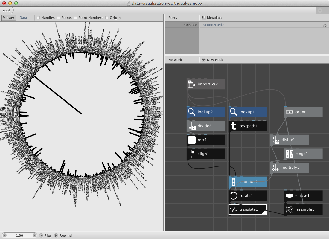
Have a look at the csv file and notice that it has a lot of columns. Let's add the depth and magnitude to it.
- Create a lookup node and set Key to Depth.
- Create a divide node to enable scaling of the number. Connect lookup2 to Value1.
- Create a rect node. Connect divide2 to Width. Set Height to 5.0.
- Create an align node and connect rect1 to it. Set HAlign to Right.
- Finally create a combin node to store all shapes in them before the transformation nodes (rotate and translate). Then send this combined shape to rotate1.
You can change the second value of the divide node to make the rectangles longer.
- Create a lookup node and set Key to Magnitude. Connect import_csv1 to it.
- These are all rather small numbers so let's create a multiply node. Connect lookup3 to Value1 and set Value2 to 5.0.
- Create an ellipse node and connect multiply2 to Width and Height.
Now we need the location of the rect we've been using to visualize the depth parameter. It can be retrieved from divide2 which we used to give rect1 a height.
- Create a negate node and connect divide2 to it.
- Create a make point node and send negate1 to X.
- Create a translate node. Connect make_point1 to Points and ellipse2 to Shape.
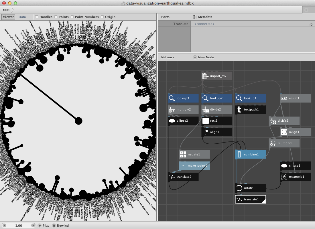
Give it color by adding some color nodes and colorize nodes.
Random pie.
Nodebox allows you to create subnetworks. You should read the subnetworks page if it doesn't ring a bell.
Below we will have a look at a similar principle as in the first example except that we will visualize the numbers in a piechart. The construction of it will use a subnetwork.
Let's start by creating a set of numbers. I want to be able to increase the amount of numbers in a seperate node.
- Create a number node and set Value to 11.0.
- Create a random numbers node. Connect number1 to Amount.
- I want to turn this into a percentage so create a sum node. Connect random numbers1 to it.
- Create a divide node. Connect random numbers1 to Value1 and sum1 to Value2.
- Create a multiply node and connect divide1 to it. Set Value2 to 100.0. You can rename it percentage by right-clicking the mouse and point to Rename.
- We want to construct a pie chart so a conversion to an other range might be handy. Create a convert range node. Set Target End to 360.0.
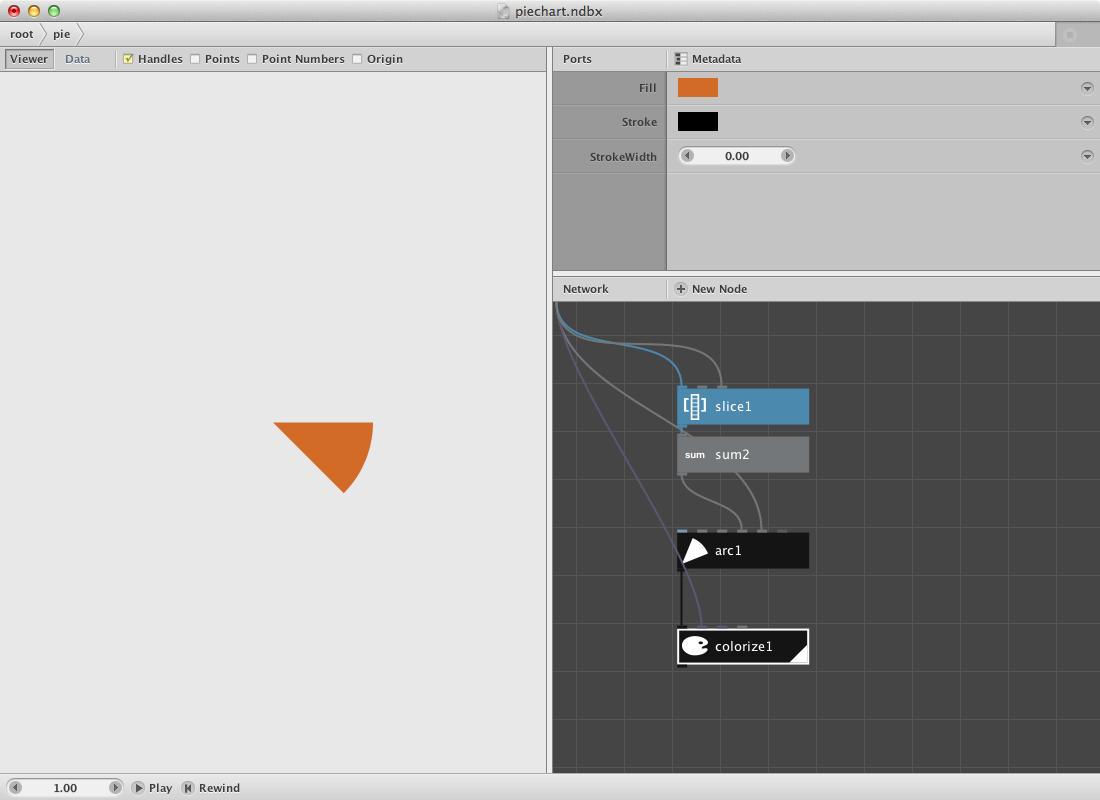
Now for the pie. We will make a pie by using a arc node which has a few interesting parameters. The idea is to create a network that takes an increasing slice of the random numbers list to make a sum of them. This will go to the Start Angle* parameter of the arc node. The degrees of the arc will be retrieved from our convert_range node.
- Create a slice node. Connect convert_range1 to it.
- Create a sum node. Connect slice1 to it.
- Create an arc node. Connect sum2 to Start_angle and convert range1 to Degrees.
- Create a colorize node and send arc1 to Shape.
- Select slice1, sum2, arc1 and colorize1. Right-click and Group into Network.
- Right click it again and rename it 'pie'.
- Right click it once more and Edit Children.
- Publish Size of slice1, name it 'Slicesize'. Publish Fill of colorize1, name it 'Fill'.
This is how the subnetwork and all its published port looks:
Go back to the root network and
- Create a range node. Connect numbers1 to End.
- Connect range1 to Slicesize* of pie.
- Create some colors and connect them to Fill of pie.
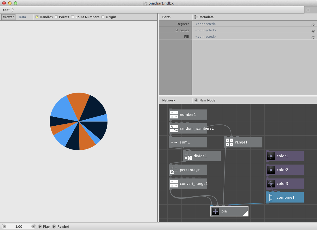
You can change the number of slices by changing numbers1.
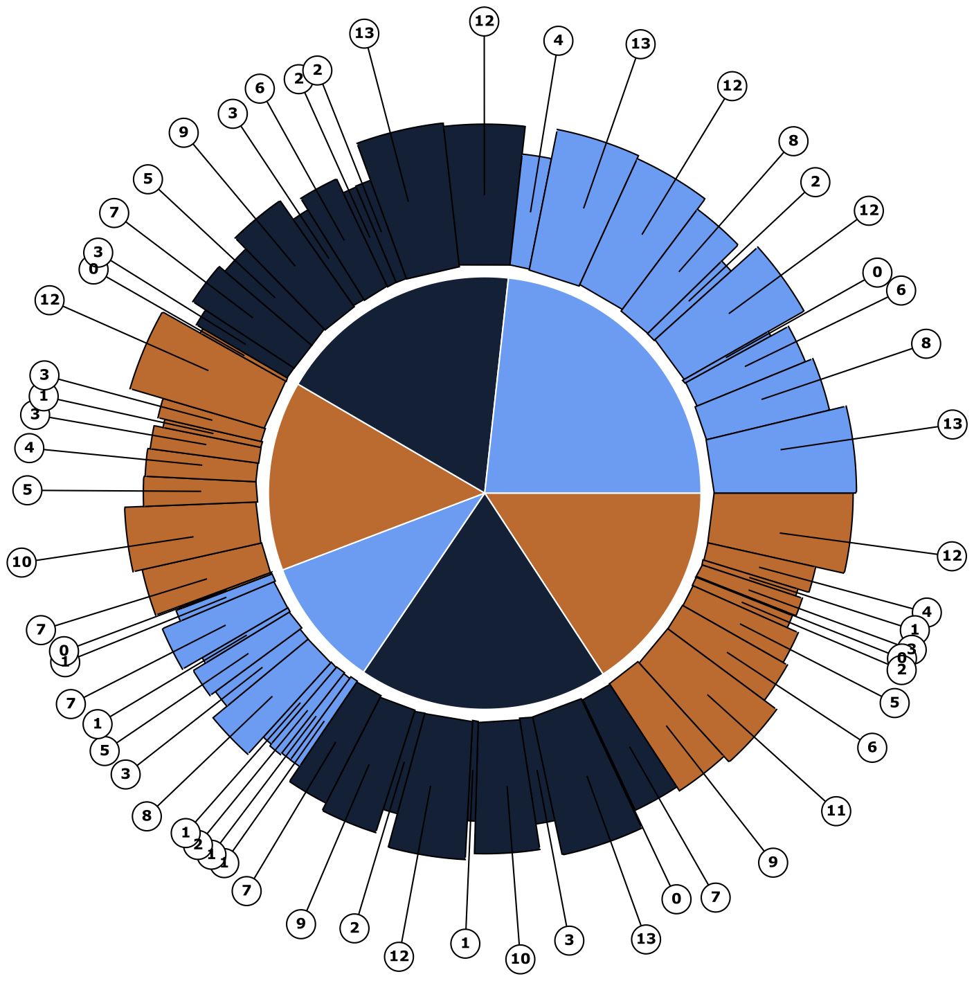
Below is a pie in pie chart. This involves creating another subnet of the previous pie so it can be repeated for multiple sets of random numbers.
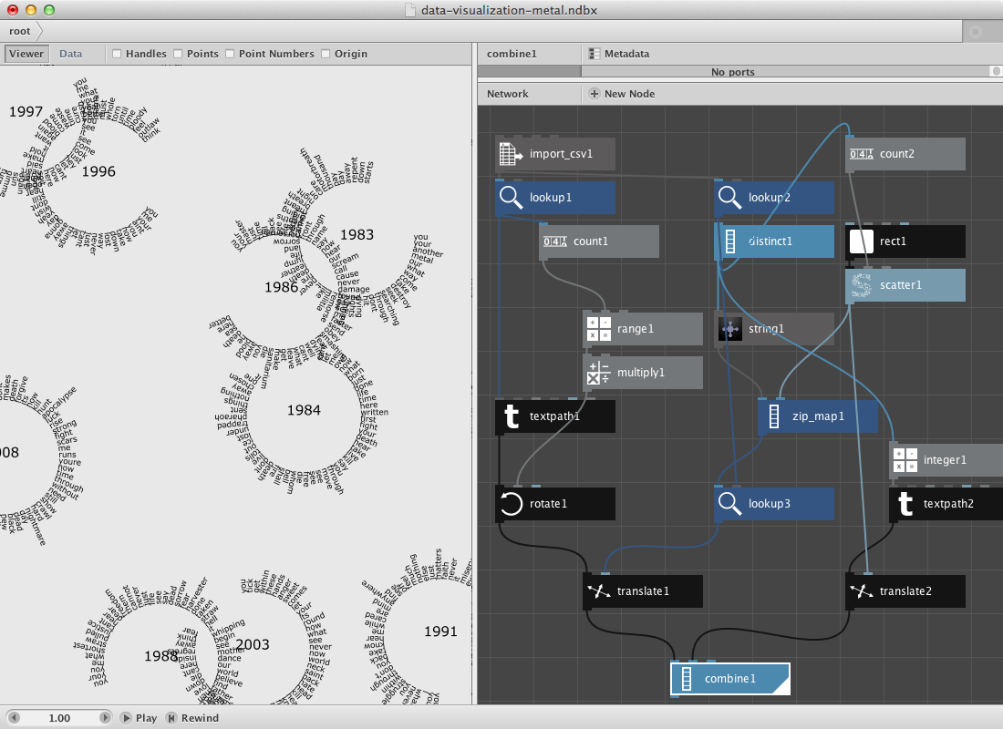
A zipmap example.
The zipmap node is an interesting node to have a separate example for it. Following datafile shows a selection of most used words on each Metallica-album. It was made using Textalyzer. Download it.
- Create an import csv node and look for the csv file.
- Create a lookup node. Set Key to Word and connect import_csv1 to it.
- Create a textpath node and connect lookup1 to text. Select a font and set font size to 14. Set Align to Left and the x value of Position to 100.0.
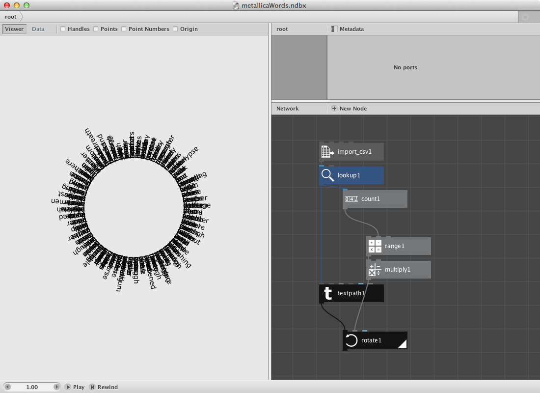
Now we will place them on a circle.
- Create a count node and connect lookup1 to it.
- Create a range node and connect count1 to End.
- Create a multiply node. Connect range1 to it and set Value2 to 6.
- Create a rotate node. Connect textpath1 to Shape and multiply1 to Angle.
- Render rotate1.
In the second section we will create a set of points based on the number of albums. Note that the datafile points to the year in which the album was released. We will than decide that word from one album all go to the same point and that for each word.
- Create a lookup node. Set Key to Year.
- Create a distinct node. Connect lookup2 to it. Distinct removes all duplicates, what remains are 9 years each standing for one album.
- Create a count node. Connect distinct1 to it.
The idea is to generate a number of points. We will do this be using a rect node connected to a scatter node.
- Create a rect node. Set its dimensions to 500 * 500.
- Create a scatter node. Connect rect1 to Shape. Connect count2 to Amount. We now have 9 points.
- Create a zipmap node. Connect distinct1 to Keys and scatter1 to Values.
- Create a lookup node. Connect zip_map1 to List and lookup2 to Key.
The viewer pane will reveal only the same set of points but if you switch to data view you will see that each point has multiple points behind it (at the same location).
We will glue these two together.
- Create a translate node. Connect rotate1 to Shape and lookup3 to Translate.
- Create an integer node. Connect distinct1 to it.
- Create a textpath node. Connect integer1 to it. Select a type and a fontsize of 24.0.
- Create a translate node. Connect textpath2 to Shape and scatter1 to Translate.
- Create a combine node. Connect translate1 to list1 and translate2 to List2.
- Render combine1.
More zipmaps allow you to do more complex things: